
Order flow in trading:
Understanding market moves

A price chart shows where trading occurred. Order-flow data adds a view of the orders displayed in the book and the trades actually executed. At a price level you identified beforehand, this can help you assess the reaction. It cannot reveal an individual trader's intent.
Displayed orders and executed trades are two different data streams.Image: TradeNeon
Then the what.
Imagine standing beside a river. You can see the water at the surface, sometimes calm, sometimes rushing, while the currents underneath stay out of sight. You may know a similar moment in the market: your setup looks sound, price is about to break out of a range, you enter – and it turns back.
The chart shows where trading took place. An order-flow viewOrder flow concerns changing orders and executions. It shows market activity, but not an individual trader's motives. adds which orders were displayed in the book and which trades actually executed. This can help you examine what happened at a level you selected beforehand. It cannot reveal why a particular trader acted or where price must go next.
After a failed breakout, you may first look to candles, lines or indicators for an explanation. That is where the reversal is visible. To examine how trading unfolded at the range boundary, you need a closer look at executions and the displayed order book. Even those data do not provide a complete story. They add to the chart observation and may challenge a hasty explanation.
Market analysis provides the where: a price area where you expect a response. Order flow adds the what: displayed orders, executed volume and price reaction. Together, these observations give context to your decision.
What order flow shows – and what it does not
A chart compresses past trades into candles or lines. You see the outcome of a move, but only part of the process. Order-flow tools let you look more closely at what was displayed at individual price levels and what really traded there. In exchange-traded futuresStandardised contracts with a defined underlying market, contract size and expiry., for example, these two kinds of data can be viewed side by side.
Displayed limit orders
The order book shows offered buy and sell quantities. They can be added, changed or cancelled. They are not yet traded contracts.
Actual trades
Executions show where volume changed hands. Price and volume alone identify neither the participants nor their intentions.
A chart and an order-flow view answer different questions. The latter may show whether aggressive buys or sells occurred at a level, whether a lot traded in a narrow area and whether price then progressed. It cannot establish “genuine interest” or a particular hidden intention with certainty. A large displayed order may never execute.
Three questions help with this assessment: Are buyers or sellers entering aggressively? Does price stall despite those executions, or does it progress? And how does the displayed supply on the other side change? Heavy buying does not automatically mean rising prices. Every executed buy has a seller; the amount of liquidity available or replenished on that side also matters.
That is why order flow is no holy grail. Think of it as the screws and nails in a toolbox: useful alongside a plan, market analysis and risk rules. Without a connection to your trading idea, you will find conspicuous patterns everywhere. A brief volume spike or absorption in the middle of a move may simply be market noise.
CME explains how orders, changes and executions update the electronic order book. What depth you can actually see depends on the market, data feed and tool.
Why the “what” needs a “where”
Even if you can see what is trading now, a second question remains: where is it happening? For a trading idea aimed at a move lasting more than a few seconds, an arbitrary spike in delta or volume is not enough. You need a defensible area on the chart where a reaction would matter to your thesis.
Mark a support or resistance area, or the edge of a range, before price reaches it. Ask what response you expect and what would challenge your idea. When the market arrives, watch how displayed liquidity, actual trading volume and price progress relate to one another. Strong execution without further progress tells a different story from a breakout that trades through additional levels.
Do not chase every very short-term move. The smaller the time window, the less time you have to check an observation. Before price reaches your area, decide which data and timeframe you will use. A signal without context can tempt you to invent a story only after placing the trade.
Why does this price area matter to your market analysis?
What happens to executions, displayed depth and price?
Could thin liquidity or a short impulse explain the observation too?
A pattern cannot replace a stop or sensible position sizing.
The “where” and “what” work like two interlocking gears. Market analysis shows where you might want to trade; order flow helps you assess the response there. A level you have marked is never a guarantee that the market will react as expected.
Reading the order book and heatmap
The order bookA view of displayed buy and sell orders at individual price levels, also called depth of market., or DOM, shows visible limit ordersOrders with a price limit: a buy may fill at or below the limit, a sell at or above it. Execution is not guaranteed. on the bid and ask sides. It is a snapshot. Orders are constantly placed, changed and cancelled. The displayed quantity is neither volume already traded nor a promise that it will still be there when price arrives.
A heatmap plots those displayed quantities over time as coloured traces. Bright areas generally represent more displayed orders in the particular tool. This helps you see where orders rested for longer, which levels price touched repeatedly and where displayed depth fell before price approached. The colour cannot tell you who traded or why an order disappeared.
A heatmap makes changes easier to follow than the flickering numbers in a DOM. A bright trace may show that a large quantity remained displayed at a level for longer. Repeated touches show how price behaved there. A fading trace shows that displayed depth changed. Only with the actual trades can you interpret these observations cautiously. A level that price did not trade through may reflect replenished orders or a lack of aggressive orders.
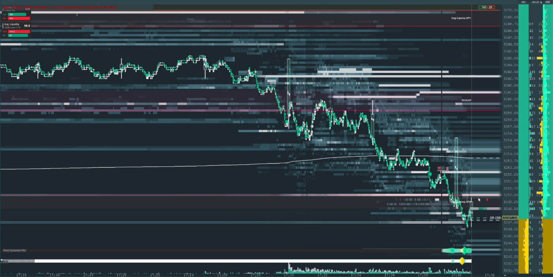
In this view, Level of Interest added coloured horizontal lines to the heatmap to mark price areas identified through prior market analysis. Those lines are analysis, not executions or evidence of institutional orders. Level of Interest can point to areas worth another look; you assess the reaction there yourself.
If a bright trace fades, order changes and cancellations are possible explanations, as is the way the feed displays depth. That alone does not prove spoofing. CME cautions against using order-book depth alone to measure liquidity. Consider executions, the spreadThe gap between the best available bid and ask prices in a market. and price response too.
A volume profile groups executed volume by price level. Delta bars and footprint charts show aggressive buy and sell executions within a candle or at each price level. An order-book imbalance compares displayed buy and sell quantities, so it is different from executed volume. You do not need all these views at once. You do need to know what data each one actually shows.
What cumulative delta adds
A heatmap mainly describes what was visibly offered in the book. Order-flow delta instead compares aggressively executed buys and sells: trades at the ask are commonly assigned to the buy side and trades at the bid to the sell side. Cumulative delta sums that difference over a chosen period and is often shown as a line beneath the price chart.
If delta rises while price makes little progress at a level, passive sellers may be absorbing aggressive buys. That is a possible clue to absorption, not proof of a particular trader or an imminent reversal. If price rises without a strong delta impulse, several explanations remain possible, including fewer offers on the other side or changing limit orders. A sharp jump in delta indicates increased aggressive volume, but does not establish a single large order.
Three contrasts are particularly useful: pressure without a breakthrough, rising price without a strong delta impulse and a sudden jump in the delta line. All three are useful observations. A single certain explanation would go too far: rising delta with a stalled price does not prove one particular limit seller. A rise without a delta impulse does not prove “hidden strength”. And a sharp jump can consist of several executions. Compare timing, price response and data quality.
The contrast between price and delta makes this view useful. Compare them over the same period and keep your feed's calculation method in mind. Delta shows executed activity; it does not show all resting orders or identify the market participants.
Three order-flow patterns in examples
Absorption: much trading, little price progress
Imagine buyers repeatedly trading aggressively at resistance while price barely advances. One-sided delta, high executed volume in a narrow area and little price progress may appear together. Opposing passive limit orders could be absorbing the buying pressure. Who placed them, and what will happen next, remains unknown.
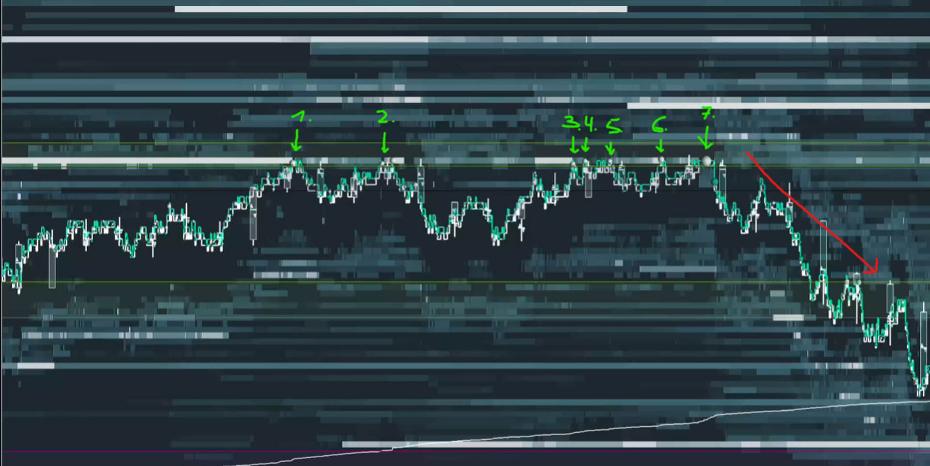
A large number in the order book is not enough to identify absorption. Look for the combination of actual executed volume and little price progress in the same area. Passive orders may be replenished, or the aggressive side may be weakening. The historical arrows in the image show where you would look more closely. They do not replace a time sequence of executions or a check of what happened afterwards.
In that historical example, the market fell after several attempts. It illustrates a past sequence, not a rule: absorption can also end without a reversal. At a level marked in advance, it is one piece of evidence to combine with other observations and your risk plan.
Sweep: trading through several price levels
In a sweep, aggressive executions take available liquidity across several price levels. This can cause a rapid price move. The chart shows the move; suitable execution data lets you check which levels actually traded. Thin displayed depth may amplify it. A steep delta move or a screenshot does not reveal whether one large participant was responsible.
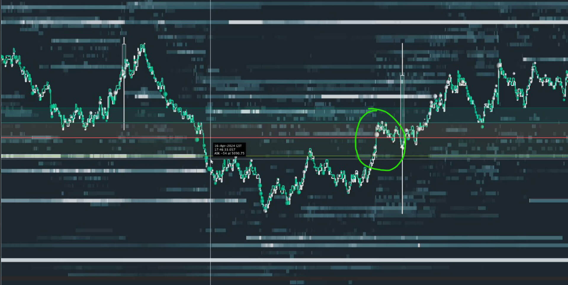
The example connects a fast price move with a previously examined microstructure. That connection is the useful lesson. The static picture alone cannot verify whether transactions took several levels in one sweep. Use it to frame questions for the execution data, not as a completed diagnosis. Several participants could also trade aggressively at the same time.
Location matters here too. A fast move halfway through an established run may be noise for your plan. At a level marked beforehand, ask the same questions: what actually traded, how did price respond and what other explanation is possible?
Disappearing orders: an observation, not proof of spoofing
A large displayed quantity may appear close to price and disappear before price reaches it. Legitimate changes or cancellations can explain that. Spoofing, by contrast, involves placing an order with the intent to cancel it before execution and create a false impression. A single heatmap cannot establish that intent.
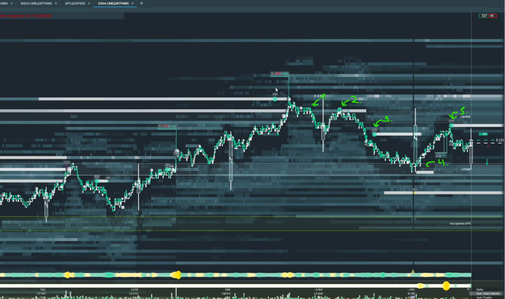
When large orders appear briefly and vanish, start with what you can observe: time, price level, displayed size and whether a trade occurred. Then check whether the pattern repeats and how price responds. Even repetition does not prove deceptive intent. Unreliable displayed depth may matter to your trading decision without accusing another participant of unlawful conduct.
CME describes spoofing in terms of intent when placing an order. Careful language matters in your analysis: you can observe displayed liquidity arriving or disappearing without knowing the motive.
Using order flow in your trading routine
That is a lot to take in. A calm sequence helps: first choose your market and a relevant level. Write down what would support your thesis, what would challenge it and when you would stay out. Then observe executions, displayed orders and the price response. A striking colour or number becomes an observation you can test.
Order flow takes practice because one pattern rarely has only one interpretation. Absorption need not end in a reversal; a sweep does not identify a trader; a disappearing order does not prove deception. The question is whether what you observe at a level you selected beforehand fits a sound plan.
Level of Interest helps identify potential price areas for market analysis. It is not an order-flow display and cannot make a trading decision for you. If you want to explore the full process of market analysis, execution and risk management, TradeNeon's day-trading programme is currently available in German.

What is order flow in trading?
Order flow concerns a market's changing orders and executions. Depending on your data feed, you may see displayed limit orders, traded volume and how they change over time.
Does order flow tell me why price rises?
It adds observations about market activity. It cannot unambiguously reveal a particular trader's motive or the cause of every price move.
Is a large order in the book always important?
No. It can be changed or cancelled and might never execute. Assess it together with actual trades and the price response.
Can I identify spoofing with certainty in a heatmap?
No. Repeatedly disappearing orders can prompt questions, but a single view cannot establish the deceptive intent required for spoofing.